
A turquoise poster catches the eye and makes you want to leave. A brochure in ochre tones evokes the dunes and the heat. Even before reading a description, the color has already shaped the dream of travel. This mechanism is not trivial: the meaning of colors directly influences the desire to travel, the choice of a destination, and the way one envisions a stay.
How colorimetry influences the choice of a destination
Have you ever noticed that booking sites use different palettes depending on whether they are selling a beach week or a city break? It’s not a decorative coincidence.
You may also like : Discover the Hidden Treasures of MSC Cruises: An Unforgettable Journey
Major booking platforms now conduct A/B tests by country to adjust the colors of their interface. An orange call-to-action button works better in some markets, while a deep blue is more reassuring elsewhere. The symbolism of colors varies greatly from one culture to another, and marketing teams continuously adapt their visuals.
What truly guides the reaction to a color is the type of experience sought. Travelers looking for relaxation respond more to visuals dominated by blue and green tones. Those seeking urban and cultural experiences are more receptive to warm contrasts, such as red or orange, associated with energy and movement. Understanding the colors of travel according to Voyagoo helps grasp these mechanisms at the level of brands and destinations.
Read also : Discover the must-see attractions in the town of La Pommeraye for your next visit

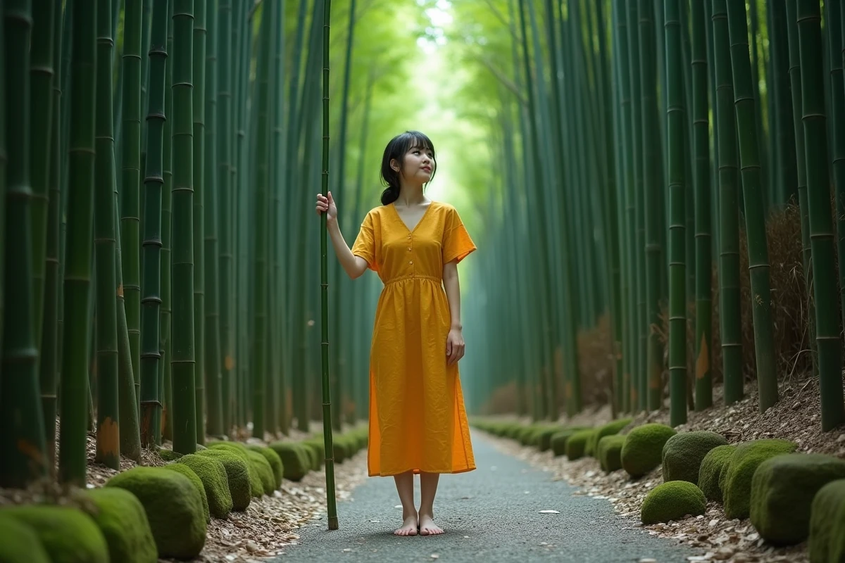
Meaning of travel colors: blue, green, red, and beyond
Rather than compiling a complete catalog, let’s focus on the shades that frequently appear in tourist imagery and what they concretely trigger.
Blue and green: the duo of rejuvenation
Blue evokes the sea, clear skies, an open horizon. It inspires trust and serenity. Green recalls vegetation, dense forests, rice paddies. It carries a promise of untouched nature.
These two colors dominate the visuals of relaxation-oriented and sustainable tourism destinations. Marketing departments of hotel groups are also integrating colorimetry into their “de-over-tourism” strategies: prioritizing green and blue in campaigns helps reposition a destination as calm and preserved, even if it welcomes many visitors.
Red and orange: the call of adventure
Red conveys passion, energy, sometimes urgency. Orange, warmer, evokes spices, souks, sunsets over the desert. These warm tones act as decision accelerators: they capture attention and prompt action.
They are often found in campaigns for active or culturally intense destinations. A festival poster, a mountain trek visual, an invitation to explore a nightlife scene: red and orange are almost systematic there.
Pink, purple, white: more targeted shades
Pink has emerged in recent years as a symbol of softness and romance. Purple, rarer in tourism, refers to spirituality and mystery. White, on the other hand, is the color of minimalism and purity, widely used for wellness retreats or Nordic destinations.
- Pink dominates campaigns aimed at couples and romantic getaways, from sunsets to pastel facades.
- Purple appears in visuals related to lavender fields, spiritual tours, or stays in Southeast Asia.
- White structures offers for winter tourism, Scandinavian design, or thalassotherapy stays.
AI-generated colors: the bias that distorts the perception of destinations
In recent years, AI-generated images have flooded social media and travel-related image banks. This phenomenon has a direct effect on the perceived meaning of destination colors.
AI-generated content over-represents hyper-blue skies and orange sunsets. Several audits of image banks have highlighted this technical bias: travel-related prompts systematically produce saturated palettes that do not reflect the reality of places.
The result? A visual normalization. All beaches end up looking alike, all deserts adopt the same flamboyant orange. A gap is created between the fantasized image and the actual experience on site. A traveler discovering a cloudy sky in Iceland or a gray-green sea in Brittany may feel disappointment born from this digital chromatic excess.
This bias is not trivial for less photogenic destinations according to algorithmic standards. Landscapes with subtle colors (brown moors, autumn forests in muted tones, gray stone architectures) struggle to compete in content flows optimized for engagement.
Using color as a compass for your next trip
Rather than choosing a destination on a map, starting from the color that attracts you the most can reveal the type of experience you need. It’s a simple yet revealing exercise.
- An attraction to blue often signals a need for calm, distance, and contemplation in open spaces.
- Green betrays a desire to reconnect with nature, to walk, to slow down.
- Red or orange point towards a desire for stimulation, encounters, urban or culinary discovery.
- White may indicate a search for simplicity, silence, and purity.
The color that attracts you the most reveals the type of stay you truly need. This approach also works in reverse: if the photos of a destination provoke no chromatic reaction, the stay may lack emotional resonance.
Colors are not just marketing ornaments. They constitute a silent language that shapes expectations, guides choices, and colors memories long after returning. Maintaining a critical eye on the palettes presented to us, especially when they are artificially generated, remains the best way to travel with expectations aligned with reality.