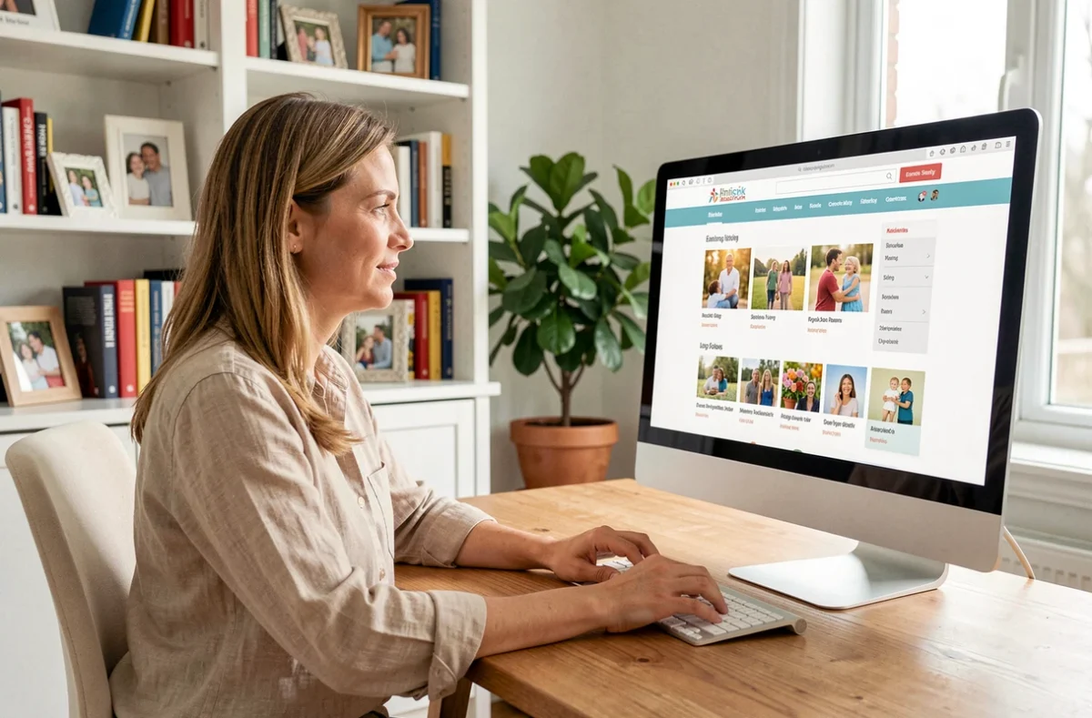
How does a website organized around family life manage to make a range of topics accessible, from task management to children’s data protection? The answer lies less in the features themselves than in how the site’s structure guides each family member to the right information, without detours.
Structure and user profiles: what the sitemap reveals
Most family platforms stack pages without clearly distinguishing between audiences. On Happy Family, the structure of the Happy Family site separates content intended for parents from that designed for children. This separation is not cosmetic: it directly stems from the requirements of the GDPR, which mandates enhanced protection of minors’ data.
Specifically, a parent looking for geolocation settings or virtual pocket money configuration does not land on the same branch as a child checking their challenges or ranking. This navigation logic reduces the number of clicks needed and limits minors’ exposure to sections that do not concern them.

Flat or hierarchical navigation: a comparison of the two models for a family site
The choice between flat navigation (few levels, direct access) and traditional hierarchical navigation (menus, submenus, sub-submenus) has measurable consequences on user experience, especially on mobile.
| Criteria | Flat navigation | Hierarchical navigation |
|---|---|---|
| Number of clicks to reach a deep page | 1 to 2 | 3 to 5 |
| Readability on mobile | High (few submenus) | Variable (mega-menus sometimes unusable) |
| Suitable for multiple profiles (parent/child) | Yes, if the paths are well separated | Risk of confusion in sub-levels |
| Maintenance of the sitemap | Simple (adding pages at the same level) | Complex (frequent restructuring) |
| Indexing by search engines | Favored (pages close to the root) | Depends on depth |
Family platforms that adopt a flat structure significantly reduce the abandonment rate on mobile. Users, often busy parents checking the site between activities, benefit from almost immediate access to the main sections: agenda, tasks, location settings, reviews, and advice.
Children’s data protection and its impact on site architecture
The GDPR stipulates that processing based on consent requires parental authorization for minors. The threshold age is set at 16 years by default, which can be lowered to 13 years depending on the member country. This regulatory constraint directly shapes the structure of a site like Happy Family.
A distinct children’s space implies dedicated pages for privacy settings, parental controls, and age verification. Recent European recommendations go further: they advocate for private accounts by default, the deactivation of profiling, and potentially addictive mechanisms for minors.
- Age verification must remain proportionate and minimally intrusive, without collecting more information than necessary to separate parent and child spaces.
- Interfaces designed for minors incorporate protective settings activated by default, which implies specific configuration pages in the sitemap.
- The navigation path must allow a parent to supervise all services (location, secure chat, pocket money) from a single entry point.
This approach explains why the “settings” section of a well-structured family site contains more pages than average: each service related to children requires its own layer of consent and configuration.

Sitemap and Google SEO: key pages to monitor
A sitemap is not just a navigation tool for visitors. It also serves as a signal for search engines. On a family site, certain pages carry more weight than others in terms of indexing.
Editorial advice pages (education, task management, family activities) generate informational traffic. In contrast, service pages (shared calendar, pocket money management, geolocation) respond to transactional queries. An effective structure links these two types of content through internal links, allowing Google to understand the relationship between a blog post on empowering children and the corresponding service page.
The “reviews” and “FAQ” sections play a complementary role. They capture trust-related queries (“Happy Family reviews,” “reliable family app”) and enhance the domain’s credibility. Their position in the structure, accessible from the main menu rather than buried in a footer, directly influences their visibility.
What the structure of a family site says about its priorities
The order of sections in a main menu is never trivial. A site that places parental advice before application features signals an editorial approach. One that highlights the family dashboard prioritizes daily use. The hierarchy of the menu reflects the target audience and the priority use cases.
On Happy Family, the coexistence of pages oriented towards “daily life” (tasks, agenda, shopping lists) and educational content (guides, resources on children’s autonomy) creates two distinct navigation paths. The first serves parents in management mode, the second serves parents in reflection mode. This duality, visible in the sitemap, avoids mixing search intentions and facilitates each visitor’s journey according to their immediate need.
Ultimately, the readability of a family site rests on a simple principle: each page must justify its place in the structure by an identifiable audience, need, and search intention. Pages that do not meet these three criteria clutter navigation without benefiting either the user or SEO.